Thursday 14 November 2013

Genesis of a Book Cover [PART TWO]

Following on from Part One this will show how different parts of the final cover came into being.

I wanted to try out a slightly different way, for me, of working, which would allow me the opportunity to A] be more adaptable about the compositional organisation of the layout and B] meant that if John [Whitbourn], the author, wanted any changes, or was to point out any suggested improvements, these could be adapted as part of the layout without major change.

Having gathered information to support the look of the costumes, the figures, the back grounds and the gargoyle motifs I set out to make sketches, which were first developed into tighter drawings before being inked as line artwork that I could scan then colour.

So where did I start? What I wanted was to work out the frame for the main images chosen for the front and back cover these, I hoped, would add to the Neo-Tudor/Gothic atmosphere I wanted to suggest.

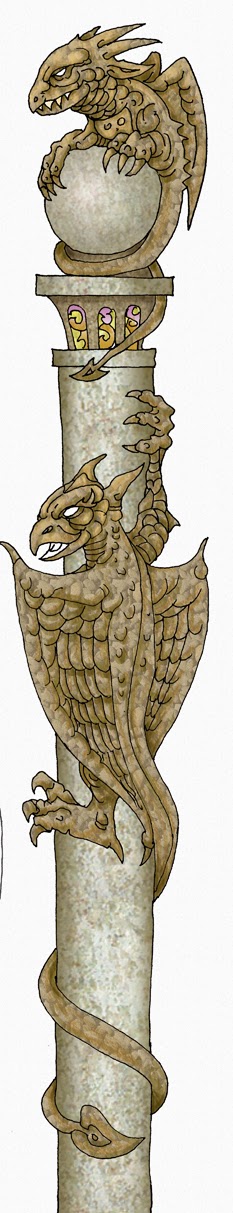
I started with the Gargoyles. In the following pictures you'll see some of the sketches, the selections and the initial colourings.


You'll note, when you see the final work, that a lot of flipping of image was used.
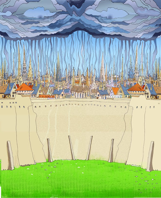
 Then I started work on the background images for each panel back and front. First the 'church' and then the city.

... then assembled together. Below is the first try out to check balance and composition.
The background panel need a view of London to act as background to Trevan.
Now it was the turn of the figure elements front and back. Several changes were made here including discussion with John where a couple of small but relevant changes were tried before settling on the second eyeball. 
 The hero Travan.


Finally came the full assembly of the panels
Then the text and gargoyle surrounds were added.

Till finally we had a full colour proof to be accepted by John [Whitbourn] the author and Dave [Morris] who is over seeing the production. 
That done I was then sent a copy of the final proof that came back from the printers.


So there you have it ... the genesis of a book cover. Some might say what a long winded way to do it, and some may not, but it's the way I did it.

Till the next time.  

Wednesday 13 November 2013

Genesis of a Book Cover [PART ONE]

This is an unusual blog because it's about one thing .. the genesis of a book-cover from the initial approach, its background, through to the roughs, the line work, the colouring and ultimately to the final cover that will see print.

I should have published this last month, but didn't [blame the usual suspects] and to my horror realise even this month is dribbling away. Why is it as the weather darkens the time moves faster when you don't want it to and slower when you do. Ah, to hark back to those halcyon days when a day seemed to last forever ... but that childhood, except in my imagination, has sadly gone.

But on to the story of the cover. I cannot claim to be a fast worker, unless on those rare occasions when the task creates an immediate unbidden response and it just flows out. To me the creative process is a magic time, yes from a professional illustrator point of view something can be turned out and I do hate missing an agreed deadline. But that is not always the case for myriad reasons. Deadlines I find are important because you can pace yourself, and learn to adjust to the needs of any task. On a personal level my first task is what I term 'thinking time' and sometimes, as in the case of this cover it can take longer than intended. This was so true in this case as this was only my third cover in colour and I wanted to create a 'look' that would be effective to both function as a good cover and mirror the elements that are part of the story.

I was approached by the author John Whitbourn around this time last year, he looking for an artist had my name mentioned to him by Dave Morris of 'Fabled Lands', 'Frankenstein' and 'Mirabilis' fame, and was, he wrote, very impressed with my displayed work posted on my blog.

Neither of us making the connection we had both appeared in Rosemary Pardoe's 'Ghost & Scholars' fanzine.


Here above are a couple of examples of mine from that excellent magazine.

I've used the wiki post as background here - John Whitbourn is an archaeology graduate and published author since 1987. His first book, A Dangerous Energy, won the BBC/Victor Gollancz Fantasy Novel Prize in 1991.His novels and short stories focus on alternative histories set in a 'Catholic' universe. His works are characterised by wry humour, the reality of magic and a sustained attempt to reflect on the interaction between religion and politics on a personal and social scale.

For more detail http://en.wikipedia.org/wiki/John_Whitbourn

John went on to tell me if I was interested in a commission for his latest book called  'THE TWO CONFESSIONS', a loosely connected sequel to 'A DANGEROUS ENERGY' (1992) and 'TO BUILD JERUSALEM' (1995), which were set in an 'alternative history' wherein the Reformation failed. '... 'THE TWO CONFESSIONS' concludes the series.

In short, after we discussed the idea I was, and John sent me lots of background material about the period of his alternative world and this trilogy in particular.

He gave me lots of information, some which I had hoped to copy here but my skills with converting different file types is abysmal to say the least but if anybody wants further info drop me an email and I'll pass it on. 

But initially this is a summary of what John sent and which we discussed.

This included a synopsis of the book, a proposed ‘blurb’ and a document outlining the so-called ‘Continuum World’ in which ‘THE TWO CONFESSIONS’ (henceforth TTC) is set.

Information about the the two previous books and their covers, and that 

the 'look' of people and the structures in the Continuum World is that 

he always visualised them as ‘High English Victorian’ as evolved from Imperial Spain at its zenith and the court of Mary I. Plus ‘The Baroque' ‘given its 

head’ and allowed to go wild…


Four incidents in the book occurred to him that might act as possible subjects:


 1 ] The hero is exiled from London and there is a scene where he surveys the distant City (still confined within enhanced-medieval/Roman defensive 

walls and church spire festooned) and, in so many words, shakes his fist 

at Fate.
 
2 ] The hero – a conscript and in militia uniform – stands atop London’s baroque walls/battlements and broods over the distant sight of the town 
of Reading ablaze (having been brutally sacked during civil strife). It is during this that he gets the business idea that will change his destiny (and 
the World).

3 ] Departing from the outdoors theme: the hero and the few survivors of 
an exploratory expedition are pursued through an underground labyrinth (actually a long abandoned subterranean monastery) and emerge at the lip 
of a precipice. They are shocked to see below their feet a huge space 
(the former main church – cathedral-sized) filled with its new occupants (human and otherwise) who are expecting the unwelcome intruders. There’s 
an altar (transformed and abused), sacrifices and awaiting uncanny clergy…

4 ] The hero (middle-aged and prosperous now) stands atop the green hill of ‘Mount Caburn’ in Sussex). Visible are the walled town of Lewes 
and (stretching facts…) and ‘The Long Man of Wilmington’ chalk hill figure. Trevan has financed an archaeological excavation on the hill-fort atop 
Caburn and it has unearthed puzzling remains (actually dinosaur bones – a quandary to a 4004 B.C. Creation and Noah’s Ark believing civilisation). 
Also, in the background, unsuspected by Trevan, a supernatural monitor lurks…


The only other thing I’d say about imagery is that my mental picture 

of Samuel Trevan, the ‘hero’, is that of the younger (20-30 year old) Brian Moore. Who has been described as ‘the human rottweiller’…

John conceived his hero as someone short-ish, bulky and with a ‘face-like-

-fist’. However, he told me, Trevan is also a man of considerable intelligence and even more will. His primary objective in life is to secure wealth and 

status – but primarily as a means to gain the hand of a particular woman currently ‘out of his league’ (he’s a Church orphanage boy). The affection, 

is mutual, and Trevan is not a bad man but merely driven.

 
Thus the first steps were taken and I began to collect visual references that might be of use but the overall 'look' of what I wanted still escaped 
me, except to realise that the blue colour that had featured so much in 
the first two covers, should be used to continue the continuity.


So my 'thinking time' began, and although John kindly sent me over the coming weeks more information, I kept coming back to those first possible scenarios and that was where I was when I asked for clear information

about page sizes, etc. which also involved input from Dave about the practicalities of print reproduction for the book, and so after some more thought and planning I discarded other versions and sent my first roughs as proposals for reaction.  


There were three roughs sent. The idea for the front, the back, and the whole book with the spine added, which derived from the idea originally proposed as in 3. In doing so I took several liberties, but hoped John, and Dave who was formatting the book, would like the idea.


Originally, I was only doing the illustrations for the cover, but Dave thought that the main title and author typography should also be done by myself, and so it was decided.

At this stage, although John had given his tacit approval, we both agreed any other adaptions or changes would be made as the work progressed. It was always my intent to keep everybody in the loop, as they say, but some elements, which I will be posting have not been seen till now. The first John saw was this preliminary panel, a work still in progress, for the front cover.


But the piece had gone through several changes before that as this time I'd decided to create the work in sections before assembling it all together.

I've realised this post could go on, and on, so this will be Part One. Part Two coming soon.

Next time, and it will be in a few days [honest] I'll show more drawings and colourings of the book cover designed for ''The Two Confessions''. I cannot promise everything, but dependent on feedback there will be lots of bits, though sadly no pencils, as after inking they ceased to exist.